top of page


-
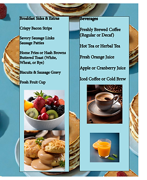
for my design choice I went for a standout menu bright colors and simple to read text
-
my restaurant is a breakfast place that specializes in pancakes and waffles. my logo is just a circle with the restaurant name and a photo of a stack of pancakes and waffles.
-
I choose this light blue because its my favorite color and I like how much it stands out. the font I choose is a simple but clean font and easy to read.
-
I incorporated the branding into the menu by making the background pancakes and making a whole section of the menu to pancake and waffle dishes
-
what I think went well was the logo the menu items. what I think could be improved is the background of the menu i think maybe less stack of pancakes and more fruit.
bottom of page